Looking Back at Bringing ‘Iron Man’ to the Big Screen for the First Time
As Sideshow Collectibles releases new 10th anniversary prints, Ryan Meinerding, Phil Saunders, and Adi Granov discuss introducing Tony Stark’s onscreen armor.
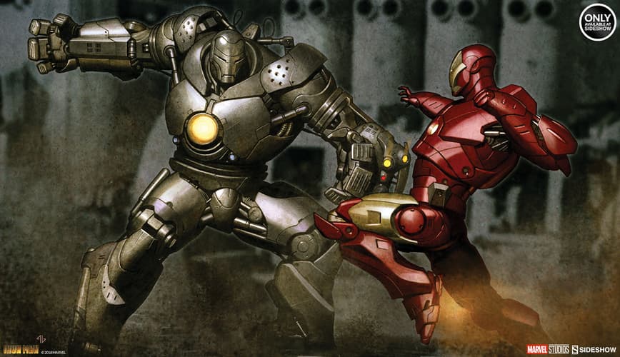
Above: Iron Man Mark vs Iron Monger Fine Art Print by Adi Garnov, available via Sideshow
In the 10 years since Marvel Studios’ “Iron Man” first flew into theaters, the Marvel Cinematic Universe has evolved in bold and exciting ways - just like Tony Stark has upgraded his armor to meet every new challenge!
Now, to mark Marvel Studios’ first ten years, and the 10th anniversary of the release of “Iron Man,” Sideshow Collectibles is releasing limited edition “Iron Man” 10th anniversary prints featuring the art of Concept Designer Adi Granov.
In celebration of this milestone, Marvel Studios Head of Visual Development, Ryan Meinerding, and Concept Designer Phil Saunders and Granov reminisced about those early days to reveal more about what it was like to bring Tony Stark's armored alter ego to movie screens for the first time, including the creative process, working with director Jon Favreau, and more...
Marvel.com: What was your role during development of the first “Iron Man” movie?
Ryan Meinerding: I was an illustrator in the art department, hired to work with Adi and Phil during pre-production. We were tasked with designing the characters and illustrating keyframe moments for the film. I designed the Mark 1 Iron Man suit and worked with Adi on Iron Monger. Jon Favreau asked me to help out with the a few sequences in the movie which included Tony's escape from the cave, moments of Tony building the suit, and some final battle shots.
Adi Granov: I was a concept artist and illustrator tasked with designing Iron Man Mark 2 and Mark 3 with Phil, and Iron Monger with Ryan, as well as painting key frame illustrations for various scenes and sets in the film.
Phil Saunders: I co-designed the Mark 2 and Mark 3 Iron Man suits along with Adi. I also created a few other elements such as Tony Stark’s Malibu mansion exterior and interior and the Stark Jet.
Marvel.com: How were you brought into the world of Marvel Studios?
Ryan Meinerding: I had worked with Jon previously on a version of “John Carter of Mars” that didn't go forward. Jon liked my work and hired me onto “Iron Man.”
Adi Granov: I illustrated a comic series, IRON MAN: EXTREMIS, which was being used as a style guide while setting up for the start of pre-production on “Iron Man.” Jon Favreau really liked it, so when we got in touch over MySpace (remember that?!), he asked me to illustrate a promotional poster for San Diego Comic-Con. That turned out to be a success, so he asked me to join the team and develop the visual look and style of the movie and the suits.
Phil Saunders: I had worked on “Zathura” with Jon Favreau and production designer Michael Riva, as well as a couple of projects with each of them that never got made, such as Jon’s version of “John Carter of Mars,” and an adaptation of “I Dream of Jeannie” that Mike Riva was designing. I was finishing on “Spider-Man 3” with Mike when we heard that Jon was doing “Iron Man,” so that was the obvious next gig!
Marvel.com: When you began working on “Iron Man” was there any idea in your mind about what the Marvel Cinematic Universe would become 10 years later?
Ryan Meinerding: I had no idea what was to come! At the time I just felt very fortunate to be working on a big Hollywood production with a super talented and creative crew that allowed me to do work that was integral to the look of the film. It was such an exciting atmosphere back then, we felt like we were blazing trails and everyone was really willing to stay late to make something awesome. New movie studios don't start up very often and the energy that came with that was an amazing thing to be a part of.
Adi Granov: There was quite a bit of excitement about the project and I believed we were working on something that could become quite successful. Certainly the designs and key frames we were doing seemed like something people would get really excited about, so yes, I had some ideas about how big this could become. It definitely wasn't a huge surprise to me that it grew to be this big.
Phil Saunders: No idea at all. At the time, Marvel was just an independent studio trying to prove itself with a movie based on what was, at the time, one of their B-list characters. All our focus was on trying to make this one movie work. There was a lot riding on the movie’s success and it was clear that much of that would hinge on whether people “believed” the Iron Man costume. It had to be convincingly real and grounded, but also cool as hell.
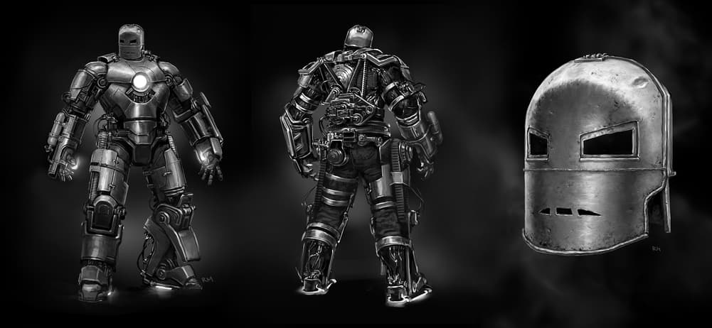
Above: "Iron Man" Concept Art by Ryan Meinerding
Marvel.com:Every different Iron Man armor we see on screen has so much personality and distinction to it. How much direction are you given before beginning the design of each suit and how does the process of designing an Iron Man armor begin?
Ryan Meinerding: It really does vary with the armor. Usually there is a conversation with the directors and producers about what the suit needs to accomplish in the film and what they want to get out of the suit. Sometimes that's as simple as, "Make the triangle in the chest work," or, "This suit needs to feel really different." Other times, for the Mark VII for “Avengers,” the direction was, "This is the suit he goes to war in." Once we have that direction and understand what is needed for the story, we will just start painting.
Once there were a few armors designed for the MCU, it was fun trying to find new ways to make him feel more advanced that the last one. Usually we explore 5-7 different new directions and we present them to the directors and producers and get notes. Then usually there is one direction that is chosen and that designer finishes the notes and does a back view. Then we get started on the 3D model.
Sometimes we have a modeler create that model, or more recently the designers themselves have been modeling the suits in ZBrush. Those models are then either turned into a maquette by Legacy Effects or rendered to a turntable that is used to get a final approval. Then our 3D geometry gets kicked over to VFX to be made into the awesome final product that appears on screen.
Adi Granov: I've never been given much direction at the start. There are discussions and I try to absorb as much information as I can from them, but overall I tend to go away and do what I think is right, and only after there is some material to show there are reviews by the director and the producers which generate feedback. Based on that, and in collaboration with other artists, the design develops and grows until a point where everyone is happy with it.
Phil Saunders: We start design pretty early on, so there’s almost never a full script at the time we start developing the new suit. There might be an outline or treatment that suggests some action we can anticipate needing to design around and the director always has a general sense of where he wants to move the design, but for the most part we’re just trying to outdo the last one and evolve the design language in an exciting way. Story is always the prime motivator, so we’re always looking for hints of Tony’s character arc to reflect into the suit.
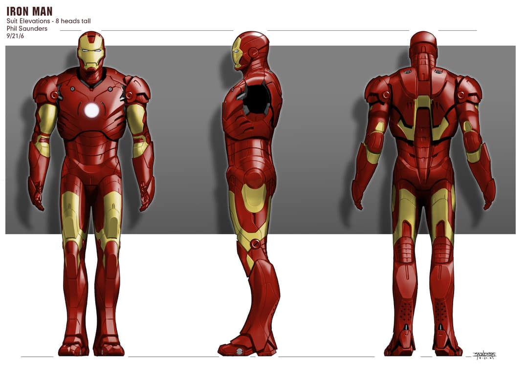
Above: "Iron Man" Concept Art by Phil Saunders
Marvel.com: When conceptualizing the armors or the environments of the film, how much do you have to think about the practicality of seeing it rendered on screen?
Ryan Meinerding: One of the coolest parts of Iron Man is that he feels like he could really function, and that his superpowers are derived from technology in a way that seems plausible. We are always trying to figure out how to make the suits seem as real as possible, whether that's about how each joint functions or how realistically the finish is rendered. We want there to be an overwhelming sense of reality in his designs.
Adi Granov: I tend to think about practicalities of designs all the time. It's just the way my mind works. Sometimes I have to push myself out of that logical approach to make things more exciting instead of the other way around, so I've never had issues with my work translating into practical props and costumes.
Phil Saunders: Most of the heavy lifting as far as the practicality of the suits we did on the first “Iron Man.” The first problem to solve was how to create a silhouette with heroic proportions out of an actor (potentially with less than heroic stature since no one had been cast at the time) wearing a physical costume with a helmet.
If you look at John Buscema’s classic “How to Draw Comics the Marvel Way,” super hero proportions are measured in “heads high,” with a typical comic book hero starting at 8 3/4 heads high. Your typical 6 foot tall man is probably about 6 1/2 heads high. Now stick a helmet on him and all of a sudden your unit of measurement just scaled up! So selling it takes a lot of sleight of hand, making the tightest helmet possible for starters, then hiding the actual width of the shoulders and changing the height with lifts in the feet. We managed to get to a proportion of around 7 1/2 heads tall, which worked really well and cut smoothly with digital shots where the proportions could be exaggerated further.
At the time, the expectation was that 75% of those shots would be practical and 25% would be digital. Really complex articulated areas like the abdominal plates and inner knee and elbow joints were always intended to be digitally replaced, so we focused on ease of articulation, especially for the problematic hip and collarbone/scapula cradle area. The pectoral cutlines circling the Arc Reactor, for example, were to allow the pec plate to pivot around that circle, allowing the shoulders to rise up with the arm.
By the end of production, though, it became clear that that ratio would be reversed, with 75% of the shots ending up digital. Now, all shots are digital, with only a “football suit” built by Legacy Effects that covers the chest, shoulders, and arms. But all the lessons learned by doing it for real have informed every suit design to date, so while digital effects have given us much more flexibility, each suit is still designed to look like it could be built practically.
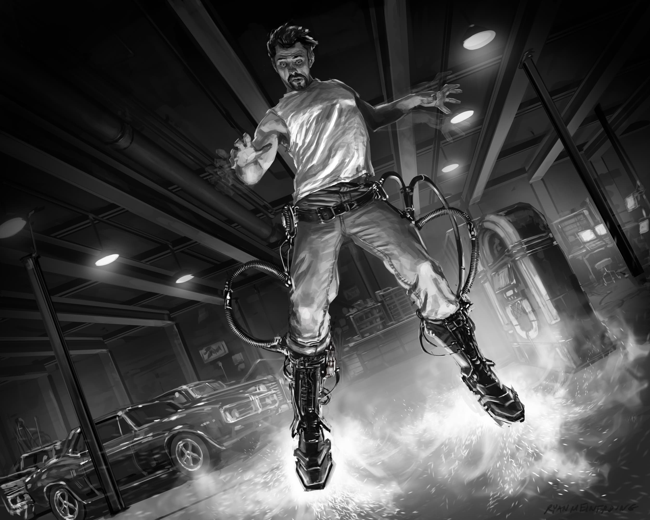
Above: "Iron Man" Concept Art by Ryan Meinerding
Marvel.com: How did you begin to visualize key scenes or moments for the movie? Does it start with the script, or do you have input at an earlier stage?
Ryan Meinerding: Most times it's about reading the script and finding a way to visualize the awesome moments in there. Other times, the directors or producers ask us to figure something out that hasn't been written yet. They will have ideas about what could be cool, but they let us run with it a little and see if anything comes out of that exploration.
The key-frames I did of Tony building the suit in the garage was basically Jon saying to me, "How could he build the suit in a cool way?" I thought the comedy of the boot test could be really amazing, so I did a frame of Tony being unsteady while hovering in his garage with a scared expression on his face. That frame ended up inspiring that sequence in the film!
Adi Granov: In most cases my work was being done before there were scripts, or at most with minimal guidelines, so the key frames I've illustrated have influenced the story more than the other way around. Sometimes the director would have an idea and ask me to paint it, or sometimes I'd just think something would look exciting and they would end up writing it into the film based on the illustration.
Phil Saunders: The Visual Development team is on pretty early, and often key-frame moments are developed by the artists that end up informing the script. It’s really a back-and-forth. The benefit of Marvel is that there’s such a rich story heritage there to draw from, so when a movie is proposed, you don’t have to wait for a final script to have an idea what’s going to be in it.
And there’s so much opportunity for innovation because each film spans a different genre. I was not involved in “Doctor Strange,” for example, but I remember working alongside the artists who were and marveling at how they were visualizing all of the magical effects, the fractalization of the world, incredibly complex and mind-bending, something that was likely just described by a couple of phrases in the script.
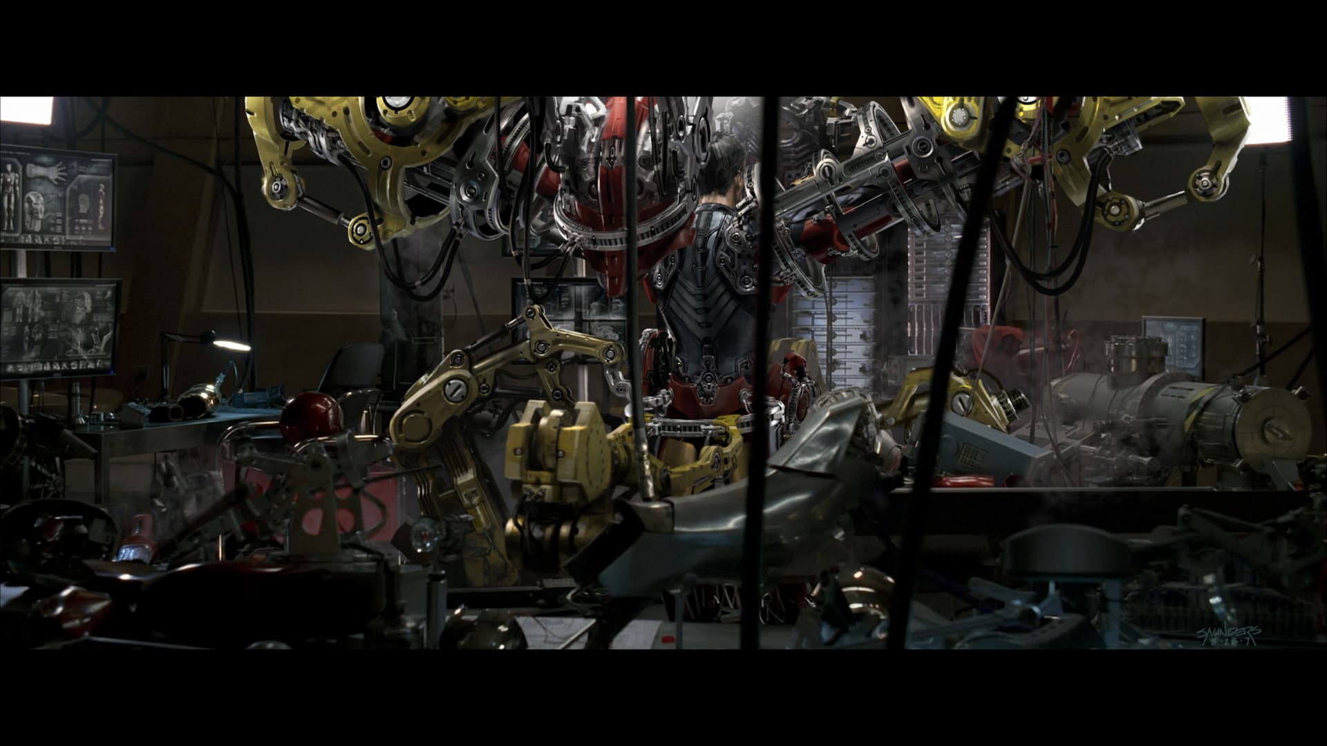
Above: "Iron Man" Concept Art by Phil Saunders
Marvel.com: What was it like collaborating with Jon Favreau on that first movie?
Ryan Meinerding: Jon is awesome! He loves working with artists directly and actually is a great artist himself. He seems to get the people on staff that he trusts and then lets them do their best work. He's really collaborative and hands on. He was reviewing our concept designs over our shoulders, he was up at Stan Winston's for reviews, and he really made sure everything was in line with his vision. I met Kevin Feige around that same time, and seeing them working together to bring that character to life was incredible!
Adi Granov: It was great! He was really enthusiastic about the art side of the process and really encouraged exploring any ideas we had. He would call me late at night to chat about Iron Man and various ideas. Some of the best scenes in the first two Iron Man movies came from those conversations. It was a lot more immediate and hands-on experience than any I've had since. They were really great, exciting days, creating a whole new universe and visual language.
Phil Saunders: Jon has always been a big fan of the art department. He was pretty much embedded with us from the beginning, when we were all crammed into a small office above a Mercedes dealership in Beverly Hills. Going all the way back to “Zathura,” he’s always been very collaborative and hands-on, very accessible, coming by frequently to brainstorm and see what we were doing. A lot of sequences on “Iron Man” were worked out in storyboard first, then shown to the writers that were working on the script, and they’d take notes and then write them into the latest draft. It was a very organic process not unlike feature animation in that way.
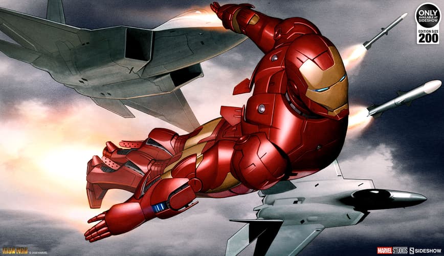
Above: "Iron Man" Mark III Fine Art Print by Adi Garnov, available via Sideshow
Marvel.com: Was there any favorite stand-out moment from production?
Ryan Meinerding: Phil, Adi and I were working very hard on the different designs and once the modeling process started we were stationed up at Stan Winston Studios art directing their digital crew. There were a couple of all-nighters involved in pushing the designs toward a final approval meeting. Those were great times. It was all very hard work, but it felt like we were all part of something exciting and were ready to stay as late as we needed to because we saw the potential the character had.
Adi Granov: I did an IRON MAN comic book cover some time before starting work on the movie. It showed Iron Man flying with military jets. Jon really liked it and asked me to do a key frame based around that idea. There was nothing like it in the script at the time, but he just liked the possibility of it.
I did a completely different painting, from a different perspective, using our newly designed Mark 3 suit, but showing Iron Man flying with jets firing rockets at him. It was written into the script, and ended up being a big scene in the film, and the painting was published as a poster at Comic-Con which Jon, Robert Downey Jr., and I signed at the Marvel booth. A really extraordinary chain of events.
[Editor’s Note: That image has been released as one of the limited edition “Iron Man” 10th anniversary prints by Sideshow, as seen above!]
Phil Saunders: Definitely the best moment was when we did the first camera tests of the Stan Winston-built Mark 3 costume on a stuntman. I remember they’d set up this wardrobe tent on the set at Playa Vista, the old Howard Hughes Spruce Goose hangar, and we all waited while the stuntman got suited up. Then when he came out of the tent… my God, that was the moment that we all knew this movie was going to work, that we had a big hit on our hands.
Marvel.com: What is your favorite Iron Man armor from the films so far?
Ryan Meinerding: I love them all, but my favorite still has to be the Mark 1. It was the first character design I did that appeared on screen and it will probably always be my favorite design.
Adi Granov: Mark 3. Always. It's where it all started and I feel we got it so right straight out of the gate.
Phil Saunders: Of the ones that have been seen, I’d have to say the Mark 45 from “Avengers: Age of Ultron.” It just hits the sweet spot for me of organic form, muscularity, and complexity that I was really striving to hit. The Mark 7 from “Avengers” is a close second. Of the ones I haven’t designed, Ryan’s Mark 5 suitcase suit I’m really in awe of. When I first heard the brief for it, I thought it couldn’t be done, but Ryan tackled the problem so elegantly, I think it’s just the coolest design. If there’s anything I wish I’d designed, it’s that one.
But really, my ultimate favorite hasn’t been seen yet. Keep an eye out in "Avengers 4." You’ll know what I’m talking about the minute you see it.
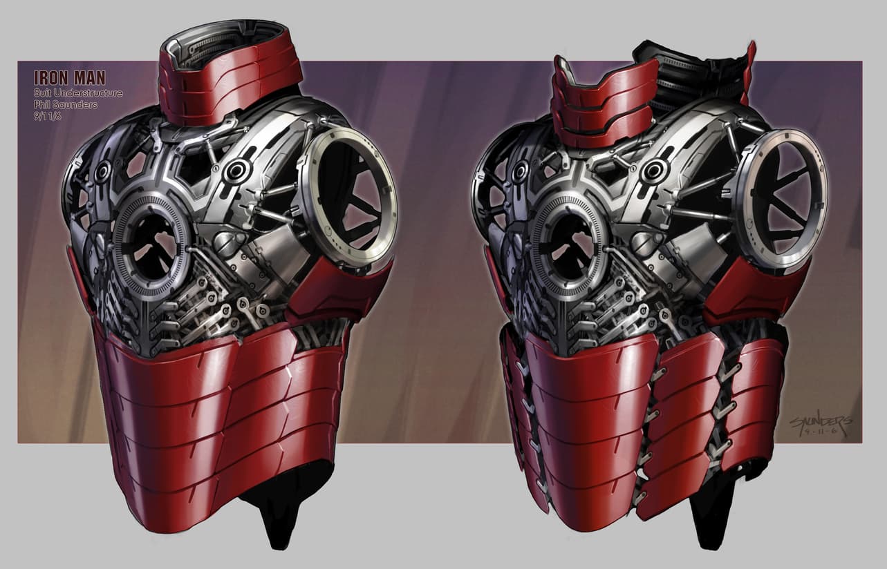
Above: "Iron Man" Concept Art by Phil Saunders
Marvel.com: How does it feel to have had such a profound impact on the MCU legacy?
Ryan Meinerding: Looking back over the years I've spent here at Marvel Studios, it's very easy for me to tear up. I've been able to work on so many characters that I've always loved and have tried to do them justice on the big screen. I've been fortunate enough to work for amazing filmmakers who are constantly pushing the quality of the films to new heights. I definitely didn't see all the potential the MCU had in the beginning, but I've done my best to keep up and deliver visuals that can inspire a new generation of fans.
I owe so much to Jon for hiring me and for trusting me to do meaningful work for him. I owe so much to Kevin Feige, Louis D'Esposito, Victoria Alonzo and Jeremy Latcham for asking me to stay on full time and start the Visual Development Department. And to my awesome team, thanks for being the best in the business!
Adi Granov: I'm not sure, to be honest! I don't tend to think about it in those terms. I do the best work I can at the time and let it go to have a life of its own outside of my control. I am happy to have been a part of the story so far and hope to be able to contribute to it in the future. I am happy and proud to see my work enjoyed by so many.
Phil Saunders: I have to say I’m very proud and honored to have been a part of this run. I’m consistently surprised by how good each of the movies has been, and how different. People keep talking about superhero fatigue, but as long as Marvel keeps reinventing the genre I don’t see it happening. My little specialist part of it has been very rewarding.
I’m occasionally asked by colleagues if I ever get tired of designing the same thing over and over again, but as a former car designer I just ask if they think the guys at Pininfarina get bored designing Ferraris all the time? Iron Man is like designing a character, a sports car, and a spaceship all in one. Really the ultimate movie prop to design and it’s a unique challenge every time.
Thank you to Ryan, Phil, and Adi for taking the time to talk to us about their behind-the-scenes experiences on this groundbreaking movie - and for providing examples of their concept art for this article.
Adi Granov’s Iron Man vs Iron Monger Fine Art Print by Sideshow is available for Pre-Order at sideshow.com/ironmonger. The Iron Man Mark III Fine Art Print by Sideshow is currently waitlisted, but you can join the wait list at sideshow.com.
The Hype Box
Can’t-miss news and updates from across the Marvel Universe!
